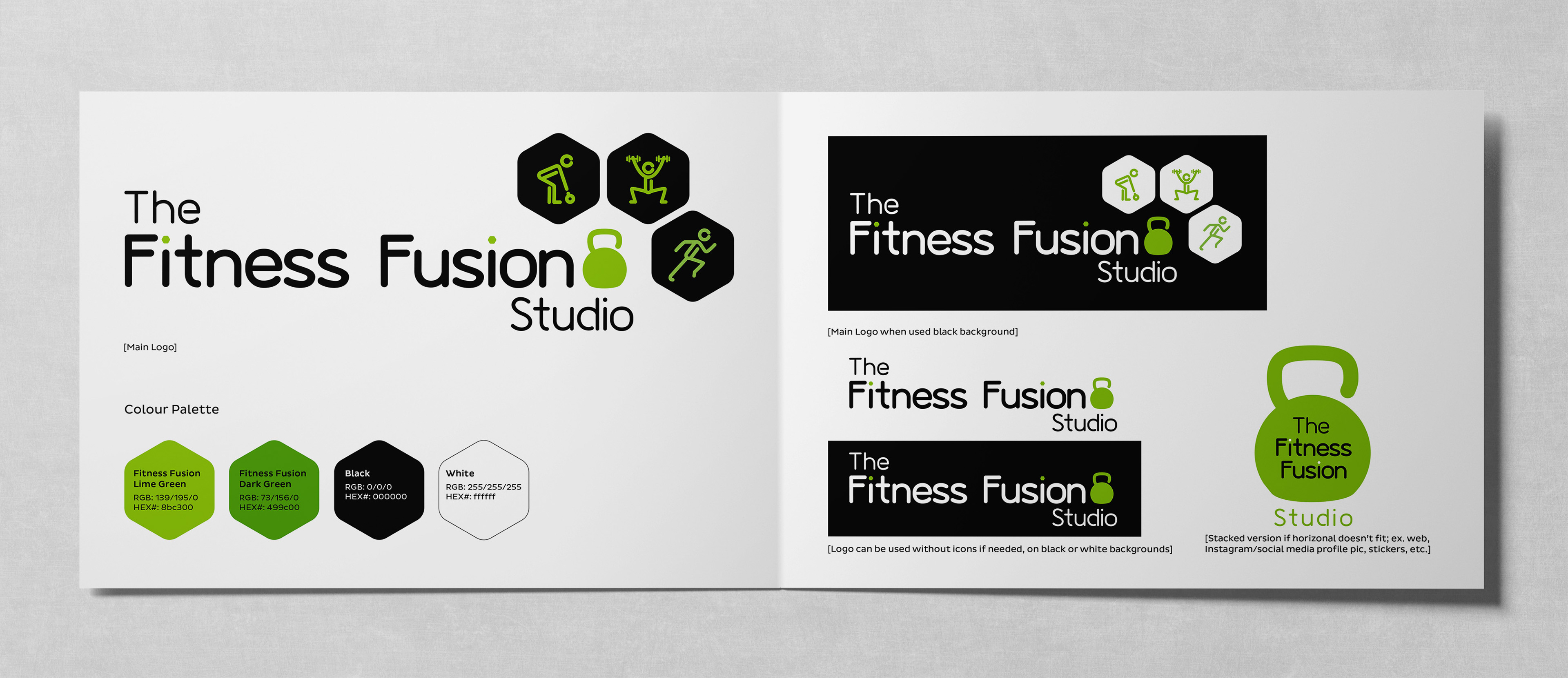
Project Overview
The Fitness Fusion Studio is located in Ottawa's Byward Market. They provide a unique blend of core, strength and cardio exercises tailored to your needs to help you achieve your fitness goals and a non-competitive environment for anyone of all fitness levels.
Jackie, the owner and primary instructor came to me with the need for a logo redesign. She wanted something similar to her existing logo but a current design targeting her kettlebells training. This includes the primary logo design, secondary logos, icon elements and social media avatar.
The Goal: Strategy & Development
The approach was to create a logo that current members would recognize and speaks to the target audience they expect to attract without looking outdated. The update needed to reflect her strengths as an instructor, so I focused on the existing icons/elements to show her range of workouts with a fresh new look. Keywords for this concept were modern, bold and welcoming.
The addition of the kettlebell icon represents the studio's primary focus.
I updated the surrounding stick figures to rounded, thick-lined icons to keep a friendly and approachable feel. I used a hexagonal shape as containers for the stick figures to imitate the ends of dumbbells. They also provide symmetry to the icons and overall balance to the logo. As Jackie requested, the colour palette remained as is, using green and black as the primary colours and white as an accent colour. Ultimately, my goal was to update the logo to better align with her brand while staying true to her core mission of training customers with the power of kettlebells.
I updated the surrounding stick figures to rounded, thick-lined icons to keep a friendly and approachable feel. I used a hexagonal shape as containers for the stick figures to imitate the ends of dumbbells. They also provide symmetry to the icons and overall balance to the logo. As Jackie requested, the colour palette remained as is, using green and black as the primary colours and white as an accent colour. Ultimately, my goal was to update the logo to better align with her brand while staying true to her core mission of training customers with the power of kettlebells.


Full logo on white and black backgrounds

Stacked logo on merch